When minimal is optimal: ‘Lucid’ Refined Interior Signage
Interior Designers have been asking for it. Takeform delivered. Introducing Lucid, the signage platform created for spaces with contemporary, minimalist aesthetics. Simple. Subtle. Unobtrusive. Like gallery fixtures that know their place, this line is designed to make the other aspects of the space look their best without feeling over-accessorized.
Designed for today’s spaces
In open, glass-inspired interiors, traditional signage can be visually heavy, adding disruption instead of clarity. Bold graphics, opaque finishes, and relatively bulky components become an impediment to the designer’s clean aesthetic. In a space full of subtlety, typical signs talk too loudly, say too much.
But Lucid says more with less. It’s the signing platform for spaces that need a finer touch. A quieter, more distinct voice. Clarity. Transparency.

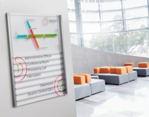
Precision components. Limitless possibilities.
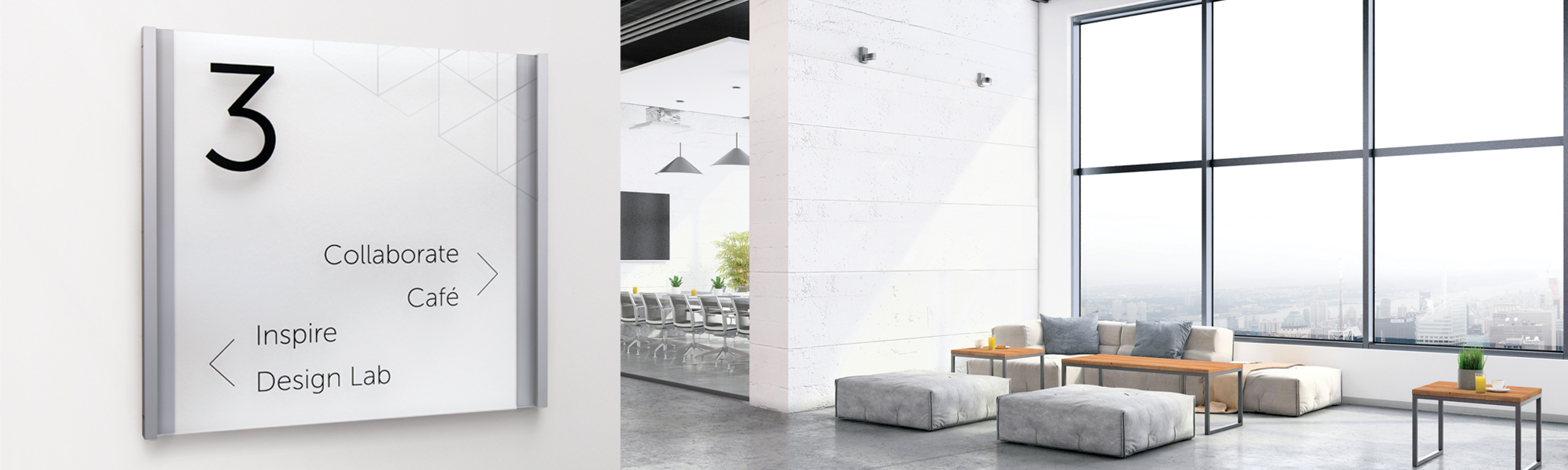
When minimal is optimal, Lucid is designed to complement discerning interiors. The look is clean. Every detail – an exercise in refinement. Mounting hardware concealed. Every line, pure. The interplay of light with the acrylic and graphics create diffused highlights and shadows, adding depth to the sign and space. Lucid is understated confidence. Quietly articulate, never overbearing.
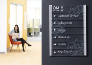
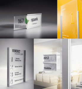
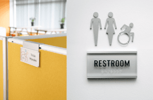
While Lucid offers an ideal complement to minimal spaces, we’ve engineered it for maximum flexibility to meet your needs. Configure its tiles, rails, and channels vertically or horizontally, mix tile and rail sizes within your system for different effects, such as extending the tiles beyond their frames. Mount directly to glass for an exceptionally clean look. For ADA, Braille balls can be specified as clear or stainless steel. Elegant pictograms provide an additional level of sophistication. Plus, Lucid even offers mounting brackets to fit virtually every workstation system.
Endless creativity. Fluent clarity.
But Lucid is about much more than components and materials. It’s graphics, too. Direct print to either side of its clear “tiles” or include a printed insert for an additional layer of interest. Like the product itself, visuals are best designed with restraint. Refined typography, understated imagery. Lucid is not about making bold graphic statements – its effectiveness lies in the details. The weight of each font. The spacing of each line. With Lucid’s minimalist approach, refinement takes center stage. Takeform’s award-winning graphic design team is available to support the creative process. We can provide original designs or help you adapt your design to maximize Lucid’s potential.
Lucid. Precisely.
Lucid provides the unmatched ability to echo the minimalist voice of your refined interior space while clearly communicating with the people who move through it. Learn more about how Lucid can make your space a minimalist masterpiece. takeform.net/products/lucid
Takeform. Branding space. Moving people.